Now The Wound Has Scabbed Over, Time to Pick at it Again: Sometimes Pop Culture is Terrible

Not being content to let things go, I felt the need to follow up my kinda-sorta “Best of 2013” list with some of its stinkers. Last year was a big movie year–more out of personal need to keep myself occupied and out of the house–which also means I watched a lot more terrible movies as well. So, again, this is mostly a movies list, with cameo appearances by terrible comics and video games.

star-trek-into-darkness

Star Trek Into Darkness: J.J. Abrams’ sequel Star Trek Into Darkness was exactly the kind of movie I imagined it would be: pompous, stupid, tedious and chasing after Wrath of Khan glory it would never get. Wrath of Khan was made with middle-aged actors, about fears middle-aged men have (obsolescence, oblivion, missed opportunity). As such, it’s light on fisticuffs and shootouts (despite being an “action” movie). Built instead around naval-warfare-in-space, with frail characters left to the mercy of technology and the cosmos, it’s less Errol Flynn and more Herman Melville. William Shatner was also at an interesting crossroad: aware his career as pretty boy lead was over, but not yet molded into the preening self-parody of today, Shatner played Kirk as a military lifer staring down retirement, set to drink himself to death in a study. He’s briefly stirred to life by the return of one-off supervillain Khan (Ricardo Montalban), only to retreat inward when faced with consequences he couldn’t weasel out of or brush off. It’s the greatest performance Shatner ever gave. Star Trek Into Darkness attempts similar introspection, but with a cast which could model for Abercrombie & Fitch on the side and spastic, overblown action scenes meant to excite toy fanboys. Even if Chris Pine were a good actor, his New Kirk lacks the footing for deconstruction. The others–from Benedict Cumberbatch as New Khan to Karl Urban, Zachary Quinto, Simon Pegg, Anton Yelchin, and Zoe Saldana–are reduced to Wacky Impersonation games, while the script is a convoluted mess of schemes by Cumberbatch and Peter Weller (wasted in a nothing role) compounded with unmotivated character arcs, bad in-jokes, lazy deus ex machina, and Abrams’ misuse of lens flare (despite the film’s slickness, it’s hideous looking). Too ramshackle for thought, too grim for fun, Star Trek Into Darkness only kills brain cells.

thewake3

The Wake #1-5 (a.k.a. “Part One”): Another entry in the pompous-yet-dumb category. This first half of the Scott Snyder/Sean Murphy Vertigo series teases millennia-spanning audacity, but delivers cheaply constructed horror sequences littered with what amounts to paraphrased Wikipedia articles about various concepts from myth and folklore. Murphy and colorist Matt Hollingsworth are reliably excellent on the art side, but next to Murphy’s more heartfelt and shocking Punk Rock Jesus it can’t help but pale. The real kicker comes with the close of issue five, and Snyder’s essay promising all the cool shit is coming with the second half, as if blessing readers who already spent the dollars on five issues for the equivalent of a polished Whopper.

LIBRARY IMAGE OF THE GREAT GATSBY

The Great Gatsby: Post-Spider-Man 3, Tobey Maguire retreated from the Hollywood machine, and public limelight, into smaller movies where he gets to act out darker impulses (Jim Sheridan’s American remake of Brothers), playing off the wholesome “Golly pie” act he brought to mopey Peter Parker. All the more baffling, then, he opted to play, completely straight, that same act for a character intended to be bitter and cynical, all while narrating prose like he’s struggling to read. Then again, everything in Baz Luhrman’s adaptation of F. Scott Fitzgerald’s classic novel hits all the wrong notes at all the wrong times.

aliens-colonial-marines-powerloader

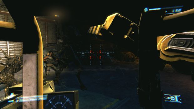
Aliens: Colonial Marines: A shoddy, uninspired FPS relying on franchise appeal? A zeal for fan fiction-level plot points in a desperate bid to reach the hallowed realm of ‘canon’ within said franchise? Buggy gameplay and subpar graphics? Even the failure of Colonial Marines lacks identity. Hobbling around as another gravel-voiced soldier spraying Xenomorph-skinned popups leaves less a feeling of being overwhelmed by unknowable evil and more of swatting pesky flies away, particularly when half the dialogue in Gearbox/Timegate’s production involves meatheads simply parroting militaristic phrases like they’re Hail Marys. But if all Colonial Marines was guilty of was mediocrity, it likely wouldn’t even rank mention. Nah, the real crime is how much effort was taken to cover up the mediocrity: Gearbox insisting its pretty, unplayable demo footage was in any way representative of how their macho fanservice vehicle would look and play. Of course, when the product shipped, and the sham shown for what it was, critics and gamers had a rare synchronicity of justifiable rage. So little else in 2013 showed as much disdain for basic craft or its audience, except maybe…

desolation-of-smaug-dragon

The Hobbit: The Desolation of Smaug: Peter Jackson one-ups George Lucas’ attempts at self-indulgent franchise destruction with a go-nowhere/do-nothing script. CGI-heavy setpieces are far removed from the tactile, horror movie quality which made Fellowship of the Rings the fascinating start to Lord of the Rings‘ cinematic incarnation, and Jackson foists upon audiences ugly, sickness-inducing gimmicks (3D and 48 frames/second) while portraying cardboard cutout characters (it would be easy to simply write “Tauriel,” but that creation is a figurehead for how little concern Jackson and crew have for characterization in these movies. Basically, you could remove half the cast and have changed precisely jack). It’s nothing more than an effort to squeeze just a little bit more out of people far more invested in Tolkien’s Middle-Earth than they are in their families. At least with Lucas, the money-grubbing excess was being done by someone looking to milk their own creation dry; Jackson’s exploitation of Tolkien is much more gross.

avenger16-universe

Avengers (volume whatever the Marvel Now one is) #16: Indifferent, lumbering nonsense masquerading as an epic. Jonathan Hickman’s faux-mythological slant and mumbo-jumbo plot beats mask a disconnect from any remotely human concern–he’s perpetually fond of “countless” body counts for his city leveling alien attacks, but refuses to depict anything other than the stoic anti-reactions of corporate mascots–which would be downright sociopathic if this were a legitimate attempt at storytelling, rather than another cynical prelude to another cash-grab crossover.

dark-skies IMG_7586.dng

Dark Skies; The Conjuring: The flip side to last year’s great horror movies Lords of Salem and You’re Next, these Paranormal Activity descendants are essentially clones. Both have the exact same structure, and not in the 80s slasher way which allowed directorial flourishes to dictate the movie (Halloween being different from Friday the 13th being different from Friday the 13th Part 2 being different from Sleepaway Camp). Both movies use the same jump scares, reveals, and camera angles at roughly the same time, with roughly the same level of pseudo-proficiency. The only real deviation is when actors hit their false notes to unintentionally hilarious effect: Dark Skies‘ moment occurs late in the movie, after an hour of mind-numbing drama and limp-wrist scare tactics, when the parents utter a cartoonish, harmonized “Nooooooo!”, getting a belly laugh out of what was intended to be climactic thrill; The Conjuring‘s comes throughout from Patrick Wilson’s deadpan explanations of supernatural phenomena (“That’s to mock the Holy Trinity” or “That’s where the witch hung herself”). It’s as if Wilson were channeling TV home improvement host Bob Vila. Inadvertently, he exposes The Conjuring (given an R-rating for its supposed scariness) as the cheap television formula it is. The movie’s inability to dramatize any emotional toll on either of the families at its heart–the haunted Perrons or the ghost-hunting Warrens, struggling to maintain domesticity in a house stuffed with supernatural relics locked away like guns, leading to a lame third act tease–means there’s no theme or subtext to what it depicts. It’s all artifice.

pacific-rim-sasha-kaidanovsky

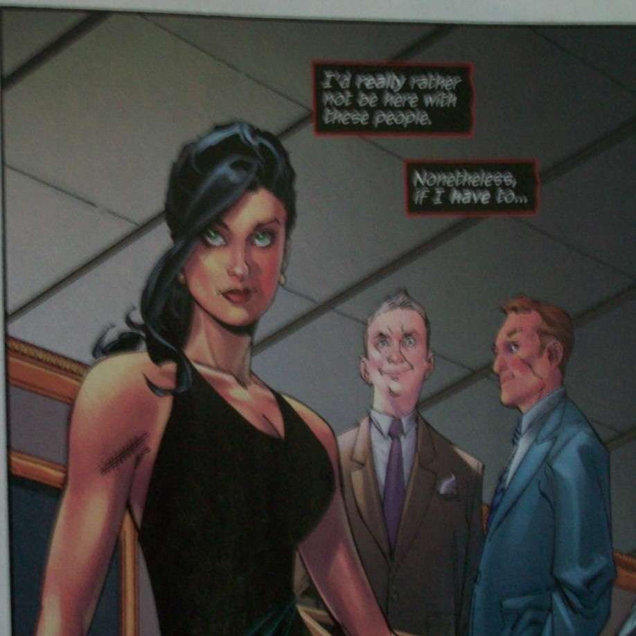
Pacific Rim: I’m already regretting putting this here. Not remotely awful like the rest of the list–it in fact has moments of genuine greatness in it–but no other movie represented the worst tendencies of Hollywood and nerd culture better. Championed for all the wrong reasons (even by me for a minute)–“It’s multicultural!,” “It has a strong female lead!,” “It’s a bunch of things you liked as a kid!”–all of which turned out to be utter bullshit. It’s multicultural in the same way every American studio-backed summer explode-o-thon is multicultural (that is, the white American guy is still the de facto main character driving the plot, no matter how uninteresting he is), its female lead (Rinko Kikuchi as Mako Mori) is a fetish object (introduced via Old Hollywood glamor shot) who spends most the movie with a perpetual pout as the boys decide her every action (“But, she beat de facto main character in one fight!“…right before literally regressing to a child)*, and homage to anime, tokusatsu and giant monster movies isn’t substantial enough (especially when your monsters are bluish-gray blobs of indistinct CGI, lacking the voice of Toho stables like Godzilla, Mothra, or Rodan).

*The only good interpretation of Mako Mori I’ve heard was given by a friend who loves the movie. Paraphrasing her words: the character is a woman in a male-dominated situation and acts accordingly. Sensible, yet doesn’t strike me as feminist.

Guillermo del Toro is good enough to make Pacific Rim a single-view, throwaway popcorn flick: with fitfully intriguing world-building (the slums built around Kaiju bones), a great Hong Kong fight scene and reliable performances from Kikuchi, Idris Elba, and Charlie Day, he gets to play with his toys for 2+ hours and not be a complete waste of time. Furthermore, his commitment to themes of extinction and total war means audiences aren’t left with another dumb franchise hook the way all these summer movies end anymore. If anything, the sparse characterization and creaky script indicate del Toro knew this was nothing more than disposable entertainment with a massive budget, slanting his filmmaking accordingly (after At the Mountains of Madness failed to get greenlit, a director as non-prolific as del Toro probably wasn’t being picky).

The hype and excessive fanboy support for this movie is, ultimately, what kills it. Which bugs me a bit: when critiquing a movie, it’s traditional to completely disregard those elements, but the movie not only plays into them, it practically required them.  With broad stereotypes/archetypes for characters (a problem it shares with The Hobbit), and sluggish to get anywhere, Pacific Rim is all about reminding the nerdier crowd they’ve seen these things somewhere before, and that it’s “cool” now to see them this way. This is a movie which had a fan club before it even saw release–just think if back in 1977, there were people camped out front of theaters for a month dressed as Chewbacca before Star Wars was even a thing–whose press release virtues as a multiculturalist, feminist-empowerment movie were parroted all across the internet, accompanied by a gaggle of man-boys who chin-stroked over the Bechdel Test’s “uselessness” (because the movie wouldn’t pass) in the same year they’ve done everything else to discredit, discourage, and disdain women for speaking out about comics/movies/video games’ treatment of them (both in the actual works and industry practices). All of this strikes me as a greater symptom of corporate brainwashing: most of those who loved this movie in fact loved the marketing of the movie, and have thus made the product a cause to rally behind, trampling over dissenters.

This fanboyism isn’t exclusive: it certainly pops up in the psychotic rage over negative reviews of anything from the Marvel Studios Avengers Assembly line, Christopher Nolan’s Batman trilogy, The Amazing Spider-ManThe Lord of the Rings/The Hobbit, or Star Trek Into Darkness. But with those there’s a logic to it, twisted as it is. The fandom there is rooted in books, TV shows, even other movies which took decades to develop their own sub-subcultures. Part of it was aided by marketing, sure (what isn’t?), but it went hand in hand with a genuine emotional response from people who became obsessed with what they saw, read, heard. This? This was packaged with the fanboy mania by shills and marketers, which is the worst kind of toxic.

Comics Sometimes Pass the Bechdel Test

Mythopolis #1
Art by Marco Turini
Writing by Richard Emms
Published by Ardden

mythopolis-1

The title “Mythopolis” conjures up an image of urban fantasy. Where the modern and the mundane collide with the ancient and the fantastical. Yet, apart from its unheralded cliffhanger page, Mythopolis the comic isn’t about this. It isn’t even about what is actually depicted in the comic’s bulk: the plotless, clubfooted heist/revenge thriller spread between nearly a dozen characters (two of which are bald white men with goatees Marco Turini took the liberty of drawing exactly alike,  which gets fun when one of them is killed) never remotely threatens to be interesting, even with a ticking clock counting down along the bottom of each page. The counter teases a Revelations-level apocalypse, while a love triangle between crooked cop Danny, prostitute Holly, and corporate slimeball/mayoral candidate Jacob has inklings of a class warfare version of Othello. Richard Emms’ script, however, fails to connect with any mythic connotation, doesn’t indicate any stakes beyond mysterious “product” being shipped and/or stolen, then stops with three hours on the clock and nothing of substance gleamed. The personalities are vacuous and cliched (Jacob, get this, publicly claims affection for New York City while privately bashing the city), the motivations nebulous (a Tokyo businessman talks about revenge for a slain son, but against who or even what happened are not even hinted at), and themes are noticeably absent. Like the happily-mediocre products of Robert Kirkman and Bill Willingham scripts, Mythopolis aims, presumably, for a late night cable spot–Emms even uses terms like “episodes” and “pilot” to describe the series–yet can’t be bothered with a coherent pitch. It conjures nothing.

The Wake #5
Art by Sean Murphy
Writing by Scott Snyder
Published by Vertigo

the-wake-5

The first three panels Sean Murphy draws, depicting oceanographer Lee dipping her hand into seawater reflecting a starry night sky, are more literary than every other page published in The Wake thus far. Murphy obliterates the horizon, melding sky and sea together to suggest a continuum of existence, with the ocean as past and space as future. Lee, humanity’s present, reaches out like Michelangelo’s Adam, seeking the origins of her existence (the chapter is titled “The Source”). This subtle grandiosity becomes symbolic of the issue’s bulk, which demarcates Lee’s flashback from the closing page of dystopian descendant Leeward suiting up to explore a flooded city (her hand in the page’s first panel would be receiving Lee’s if the two images were side by side). In some ways, it follows the trajectory of Murphy’s blasphemous, brilliant Punk Rock Jesus, with the mother passing the baton of narrative to child–directly to Lee’s son Parker in a tearful goodbye, indirectly to Leeward. The Wake is less effective in its handoff, investing its first five issues (Jesus‘ entire length) to an often nonsensical, formulaic monster movie plot and complete ciphers–once again, Scott Snyder uses High-Concept exposition to relate myths (this time the Great Flood) to the plot, satisfied with merely surfing the web for ideas. In spite of this ever-literal script, Murphy approaches Kirby’s Kamandi, The Last Boy on Earth in communicating cosmic and humanist ideas, exploring the tension between them (his slender panel of a damaged submersible sinking to the depths is gripping). These moments almost make The Wake worth the hype.

Catwoman #25
Art by Aaron Lopresti
Writing by John Layman
Published by DC

Since it’s been a whole issue since Catwoman had a crossover, DC has seen fit to throw it into Zero Year. Much of this reeks of last minute desperation, with Aaron Lopresti and John Layman pinch-hitting for Ann Nocenti and Rafa Sandoval mid-arc. The difference is night and day: Lopresti is strictly late 90s house style, but he is much more successful depicting Gotham City than he was with Gemworld over in Sword of Sorcery (for starters, he populates his backgrounds with people to give a sense of life beyond the walls of plot), while Layman casts aside his Chew humor in favor of a yeoman’s touch. He follows Nocenti’s populist outrage (his Catwoman expresses disgust at the extravagance and debauchery of a billionaire’s party) and how it relates to the anti-heroine’s Robin Hood-justification (slightly more conscious than the gas-stealing ninja in Occupy Comics). What Layman lacks, however, is the commitment of Nocenti’s voice, articulating modern Progressive ideals Gang War and Down Under which subverts DC’s larger, more reactionary trends (notably, her scripts are some of the few superhero works which pass the Bechdel Test, an achievement noticeably lacking with Layman). And while Lopresti is game for scenes of Selina Kyle punching and kicking corporate thugs, he’s at a loss with those involving the socialite party. He’s neither excessive with those panels to capture her repulsion/fascination (she takes up a whip, saying it “feels right”)–the way Rafa Sandoval stretched limbs to and skewed perspectives for psychological, funhouse affect–nor implicating enough upper-class horror. Lopresti leaves Layman stranded halfway to noir and unable to commit to the cause, right where DC wants its hired hands.

catwoman-25

Throwing His Mighty Avengers

amazing-spider-man-essential

From Essential Spider-Man vol. 1 (Amazing Spider-Man #15)
Art/Plot by Steve Ditko, Words/Editing by Stan Lee

So, The Comics Journal has yet another Kirby/Lee argument going. Yet again, it devolved into a shouting match about whether or not Stan Lee is a doodoohead who couldn’t write his way out of a paper bag (or something?), overtaking Robert Steibel’s wonderful breakdown of Jack Kirby pages and the “Marvel Method” (again). Essentially, if you read any Comics Journal comment thread on the subject, you’ve read this one. Exactly. If there isn’t Patrick Ford’s contempt for genre (happily promoted by the Journal) or Robert Stanley Martin’s contempt for sound rhetorical skills (promoted by a guy named George), everyone seems contemptuous of saying anything of substance about creator’s rights, because they’d rather treat the system which starved out so many old pros as Team Edward/Team Jacob shenanigans (or Marvel v. DC shenanigans, even). More about egos than principles in the House That Groth Built.

*sigh*

Mighty Avengers #2
Art by Greg Land
Writing by Al Ewing
Published by Marvel

mighty-avengers-2_hey

With Mighty Avengers, Greg Land seems to be trying to prove something here. The tracing–fashion mag, porno, or whatever source is this week’s Greg Land joke–so often present in his pages is dialed back to a handful of civilians, as are the celebrity referencing which also typifies his work. While the dominance of Spider-Man masks (be it Octo-Spider-Man or “Spider-Hero”) and Kirby-themed alien invaders can be a partial explanation, even characters shown with regular faces (Luke Cage, Dr. Strange, and an oddly whitewashed Monica Rambeau) all seem to be drawn entirely from Land’s pencil without copying.

mighty-avengers-2_shark

Would be admirable, if the result did not immediately draw attention to Land’s numerous other faults. Namely, the plastic nature of his faces and barely coherent action. Fist fights are stuck in forever muddled closeups, more often content with showing the faces of who is doing the punching rather than the actual act of the punch, eliminating all sense of space and movement within his single-panel, meticulous recreations of Manhattan. And while Land’s photoreferenced horrors from comics like Iron Man or Ultimate Power helped discredit the Comic Realist art movement once popularized by Bryan Hitch, John Cassaday, and Steve McNiven (who managed to emulate realism through body language and facial expressions which matched what the script calls for, what Land never grasps), worse still is his attempt at depicting a shark torpedoing through water: so ramrod stiff and lifeless it may as well be a picture of a block of wood, there’s hardly any of the brutal, prehistoric grace one gets from Sean Murphy’s moody artwork in The Wake.

mighty-avengers-2_cage

This proves to be yet another mismatch for writer Al Ewing, whose American work (such as his otherwise excellent Jennifer Blood run) has been marred by inconsistent, anatomically challenged artwork (being paired with Butch Guice for an Age of Ultron tie-in was a stroke of mild genius, offset by it being an Age of Ultron tie-in). Ewing’s snappier moments–including his depiction of Dan Slott’s “Superior” Spider-Man as petty, small-minded, and possibly bigoted–are undone by Land’s sloppy setpieces: Spider-Hero at one  point “steals” a beatdown from his namesake, mocking “Superior’s” logorrhea (“Less #$%@, more hit”); Land draws the characters in total isolation from one another (Spider-Man shouting “Hey” off-panel when the steal occurs), diluting the scene’s impact. A later brawl between Luke Cage and the sadistic Proxima Midnight similarly isolates its characters to create the impression they are furiously punching air. Absolutely zero respect for spatial relations. Only thing Land proves is he isn’t learning.

Popeye #15
Art and Writing by Bud Sagendorf
Published by IDW/Yoe Books

Where IDW’s revival of Dinosaurs Attack has been dolled up with shiny new paper and digital lettering, the Popeye reprints stick with old-fashioned newsprint. Much to its benefit, this actually prevents Bud Sagendorf’s artwork from seeming incongruous and dated, the way Herb Trimpe’s pencils in DA seem to exist on a separate plane from the floating word balloons and captions (modern mainstream comics have this problem too, if mitigated by the fact artwork is made entirely in this digitized schema). Instead, his imperfectly colored bright reds/deep blues are allowed to pop in a format they were intended for, rather than desaturate in one they were not (the way so many old movies end up looking more hideous in hi-definition remasters).

popeye-15_next

This time capsule approach works best with the comic material: Popeye helping animals in a Dr. Doolittle riff, Popeye resolving a problem on a rail line, and side stories with Wimpy, Olive Oil, and cowboy Ham Gravy. With the Popeye vignettes, Sagendorf portrays an oddly fluid class system: his oafish, well-meaning hero exemplifying blue collar ethics and pragmatism (the comic is peppered with DIY crafting instructions), rolling up his sleeves and working himself to exhaustion, such as caring for every single animal which comes to him with a problem in “Animal Talk”; yet, he is also portrayed as independently wealthy (owning a rail line in addition to his own boat), allowing him and his supporting cast to engage in such offbeat adventures. Sagendorf seems uninterested in any particular class theory–not socialism, lifting all boats on a rising tide, nor the “might makes right” of hyper-capitalism. Even when Popeye performs feats of strength, with spinach of course, they’re deployed in non-violent means: pulling a train sans engine or walking through a wall to teach a steak-loving bully the value of eating one’s veggies. Conservative masculinity with a more pronounced empathy for others marks Popeye as a Teddy Roosevelt, a Republican who would confound and anger the Reagan-histrionics of modern-day Tea Party businessmen and fundamentalist Christians

popeye-15_diy

Mark Wahlberg Is an Overly-Excited Puppy

[Edited the title of this post to remove a cultural reference I have since learned is offensive. Sorry for my previous ignorance on this matter]

About the only big thing happening in comics things over the last week was the “Artists V. Writers” debate flaring up yet again. It’s actually a good, much needed discussion, and David Brothers chronicles many of this round’s more enticing bits here. At this point, my $0.02 is gonna matter even less than it usually does, but I will say it’s because this discussion is ongoing that I try (and often fail) to comment on as much of the production of a comic as I can in any given review. Most of the time, I end up fixating around one or two elements that I think encapsulate how I react to that particular comic. Sometimes it’s the writing, sometimes it’s the art, other times it’s the politics or the use/misuse of advertisements. Usually, it’s a combination of the first two. And, come to think of it, I hardly ever mention the inking or lettering of a comic, which isn’t exactly fair.

And yet, I continue to have nothing to say about those things in the following reviews. Not much of an epiphany, is it?

Batman Incorporated #13
Art by Chris Burnham
Writing by Grant Morrison
Published by DC

batmaninc13

The credits, a two-page spread of Batman and Talia dueling in front of an ouroboros, seems to be the key to this finale and the run that it concludes. Everything cycles back to the beginning, eating its own tail, with nary a second’s thought to changing course. Batman may get scraped up, may lose a sidekick or two, a villain may or may not die, but these things get brushed aside and more Batman comics will come out, without fail. It won’t matter how cleverly you deconstruct all the tropes, or how great your artwork is (and Chris Burnham’s inset panels of Batman and Talia making out while Leviathan and Batman Inc. battle in the streets of Gotham, and the weird gender war thing it represents, shows what a great damn storyteller he is), you’ll get replaced on that long conveyor belt to the snake’s mouth. This becomes the problem with superhero meta-fiction, which Grant Morrison’s final issue clearly is: futility and corporate servitude are the only conclusions. Even when a victory is as satisfyingly unsatisfying as the one Batman has, it’s not an ending, just a stopping point, because there’s more or less the same thing coming out next month. The only parts that matter are the little stops along the way, because even someone with as big a God Complex as Morrison realizes the broad storyline’s never going to matter with these things, because it’s just going to continue spiraling inward on itself. Morrison even has Commissioner Gordon narrate “It never ends”: Batman will brush off the wounds, get a snazzy new sidekick (and maybe a spinoff or two), and here we go again. While reading this series has been a pleasure, the inevitable fake-ending would and will leave me feeling queasy.

Lenore #8
Art and Writing by Roman Dirge
Published by Titan

Roman Dirge’s big success with Lenore is how the grotesque and the childlike overlap. Dead girl Lenore behaves exactly like a little kid, and similarly shows little understanding of the very real consequences of violence and death inflicted upon mere mortals by her guardian/buddy Taxidermy (who is revealed in the prologue to be an Egyptian protection god of children). This itself leads to her imagining a Ghost Hunters-style TV host (looking to film her and become rich) as a butterfly when she is informed that is what’s being done to him. Taxidermy himself, who is only barely seen in the comic (Lenore‘s other characters, Pooty and Ragamuffin, provide most of the interaction), attempts to balance his violent tendencies (killing people who harm children) with consideration for children themselves, which leads to the comic’s most hilarious moments (the words “You’re welcome. P.S.: I left you a sack lunch” are written for a child in the blood of his abusive parents). All in all, a charming comic.

lenore8

The Wake #3
Art by Sean Murphy
Writing by Scott Snyder
Published by Vertigo

I’m not sure if I’m meant to take this seriously anymore. The tone and direction of The Wake changes so quickly, so dramatically, it renders any real analysis of it moot. Solemn, silent pages where Sean Murphy depicts the origins of life are immediately followed by Sci-Fi Channel-movie monster-on-the-loose action sequences, and characters we’re barely familiar with are given big, dramatic moments–a poacher has a one-sided Predator standoff with the escaped merman. Problem is, that stuff only works if your audience becomes familiar with the character in question. This is usually the problem for superhero crossovers like Age of Ultron, and Scott Snyder tends to write on that soap operatic level, where interesting hooks are introduced and then paired with scenes pandering to the lowest common denominator (it’s to Snyder’s credit none of his dialogue is as dumb as “Ow! My ass!”). The Wake makes the same mistake as Age of Ultron (and Secret Invasion, House of M, and Siege, basically all of Bendis’ Avengers work) of not bothering to flesh out either characters or ideas.

thewake3

But, where that comic started as garbage and got less interesting as it dropped one hook after another as if daring readers to stop buying (a dare which I accepted and won), The Wake remains interesting. Even as the plot plays out like a stage performer going to great lengths to debase himself for the amusement of its audience, Murphy and colorist Matt Hollingsworth create a unified aesthetic that does more to make the disparate parts whole than the writing does. The last two pages have the same structure as the first two pages, with an explosion marking a dramatic shift in environment, as if we’re seeing bookends to specific epochs of Earth. It also helps Snyder isn’t forgetting about any specific aspect: the future stuff doesn’t appear, but the opening pages do recall that flooded world. The result? I’m actually willing to keep at it with this.

3 Guns #1
Art by Emilio Laiso
Writing by Steven Grant
Published by Boom

3guns-1

Clearly getting the jump on the Hollywood franchise machine (this follows 2 Guns, a movie of which is now out in theaters), 3 Guns wears its action flick ambitions on its sleeve. Every page features either violence, the threat of violence, or a woman in a tight-fitting dress. Often, there are highly skewed angles and scenes at ass height in the manner of Michael Bay excess (not an insult. Rafa Sandoval’s been doing roughly the same thing in Catwoman, and it’s been great). While Steven Grant turns in a decent enough script based around plans within plans, a fight comic should really be an artist’s showcase; problem is, the art fouls up.

A lot of the action Emilio Laiso draws is sloppy: when ex-DEA agent Bobby ambushes a militia that’s pursuing him, he manages to grab their leader right after he got out of a car that had just parked. Later, when Bobby gets in a fight with his 2 Guns co-star Marcus (who is working with Russian mobsters), he ends up punching the ground while Marcus is mid-fall. There’s no consideration for time and space, like with Paul Gulacy or Guiseppe Camuncoli, or even the stylized pose of Frank Miller, just placeholders for movie storyboards. Moreover, the junk food nature of the material would be better suited by the bright, primary colors of Matt Hollingsworth’s Hawkeye work, rather than Gabriel Cassata’s shiny, muted coloring (it certainly lacks the oppressively hot oranges and whites of the film). About the only worthy visual moment is when Grant and Laiso get contemplative: Joey, a diner girl seemingly allied with the militia, asks Bobby what is basic about human decency, with the panel half black and half brown as if to indicate the confused moral state of these characters. Everything else is apathy and cash-in.

The Long Journey
Art and Writing by Boulet
Self-Published

Calling Boulet’s The Long Journey a great webcomic almost seems a disservice. In a genre more overloaded with crap like Ctrl+Alt+Del or PVP than even mainstream publishing can get away with, this goes outside that circle altogether. It becomes refreshing and vital.

longjourney

Nominally, Boulet adopts the style of retro video games (read: 8-bit and 16-bit), although really more detailed with closeups and changing camera angles. He does carry the surrealist logic of Nintendo platformers, though, with his avatar leaving the humdrum real world through his toilet and into an ongoing fantasy land (the weird English translation adds to the effect). The comic is one long vertical mural utilizing the Infinite Canvas, forcing readers to scroll downwards. The effect is evocative of both Legend of Zelda‘s overworld and flipping through the pages of a comic book, yet is a rare instance of a webcomic that could only really work in the format of the internet (that is, unless someone wants to loan Boulet a skyscraper and let him go all Christo on it). And as the reader scrolls further downward, encountering giant plants, demons, Nazis, sea creatures, a T-Rex, and more, they are immersed in Boulet’s own escapism. The opening, a dreary rain in a gray city, is all we get of the real world, and it’s enough to go along with the deliberate nonsense that follows. Boulet at length writes about fantasy worlds like Narnia, and expresses frustration at the familiar (he shouts “Of course!” repeatedly). He even mocks the idea of traveling the world to escape as cliche (“If the world bores me, I don’t think the solution can be more world”), though the arc he follows is remarkably similar: encounter new places, note common themes (graffiti showing up in unlikely places), get in scrapes, meet a girl (a mermaid in this case), moments so brief they can hardly seem real. It’s introspective in all the right ways, with Boulet discovering his passion for life as he debates the metaphysical nature of his existence and his art, which he admits is based on whimsy. And where he arrives is beautiful.

Two Minutes Late Dude

Running behind, so less talking.

Fatale #15
Art by Sean Phillips
Writing by Ed Brubaker
Published by Image

Of Fatale‘s entire run, this one might be the most quintessential Brubaker/Phillips joint. Burnt out, hopeless men and sexy, dangerous women, the bodies and wrecked lives they leave behind, and the constant feeling of a world slowly strangling them. Sean Phillips is as efficient as ever with his layouts. Each page dials up the claustrophobia of its dual protagonists (Nicholas in the present-day framing narrative, Lance in the post-grunge 90s tale), either with tight closeups or their environment. Nicholas has been imprisoned since the second arc, but even when he’s broken out by Lance (sent by titular femme Josephine), he is always framed as being small, unimportant and in circumstances out of his control (the comic’s most arresting shot is them getting into a getaway van in an alley just off a courthouse). Meanwhile, Lance, a rock musician who robs a bank to keep his band afloat, is similarly miniscule. Sure, he robs a bank, but afterwards he worries he may be too into it (“Christ…was he already admitting there’d be a next time?”), which shows him to be fearful rather than mighty. When the two begin hiking in the wilderness, they’re enclosed by darkness and rain, with Nicholas narrating that he’s “hobbling down a rocky trail to the river, following a madman”; Lance being his past, present, and future under Josephine’s spell. Phillips’ artwork (with Elizabeth Breitweiser on colors) is as novelistic as Ed Brubaker’s prose.

fatale15-jo

Josephine herself is back to being a mystery again. The scary Other, after the second arc’s sexual liberation and the third arc’s historical introspection. She’s seen by Nicholas only in delusion, and introduced to Lance naked, alone, and with no memory following his robbing a bank. Her supernatural hold over men causes Lance to take her home. We’re then introduced to a third man: a serial killer and rapist obsessed with Josephine. This ties back in with an earlier issue depicting medieval knights whose own barbarism is only heightened by the powers of these femme fatales. Rather than another example of “pretty girl wrecks a man’s life,” it shows men being possessive/protective of Josephine. It becomes interesting how each man she encounters reacts to her curse’s influence, and how many will blame her for their own obsessions; while it’s partially true due to Brubaker’s genre choice, what doesn’t occur to the male characters is their own obsessions and inner demons dictate how they respond to her. Even then, Fatale suggests we’re all impulses and instincts when we get right down to it.

Young Avengers #6
Art by Kate Brown

Writing by Kieron Gillen
Published by Marvel

youngavengers6

One thing about Marvel’s better series lately is they’re more charming than artful. Hawkeye, Alpha: Big Time, Daredevil (and its spinoff mini-series, Dark Nights), FF, and Young Avengers lose focus or slip on technical details, thanks to double-shipping, but manage to average out over time. Kieron Gillen’s latest Young Avengers script, for instance, inserts office comedy into the superhero series, but only as a clumsy way to establish a new arc via abrupt cliffhanger (not as intelligent as Dwayne McDuffie’s Damage Control). Previous issues dealt with teen issues through superheroics (to get away from zombified parents, the characters hung out in diners and clubs), placing the action in a social and emotional context. Here, Quicksilver Jr. (a.k.a. Speed) and ex-mutant Prodigy are teens in the workforce, but we don’t get much insight for this fill-in issue. Speed builds things really quick, which Kate Brown depicts in micro grid layouts, and uses his money to party hard (during a coffee shop scene, he’s given twitchy motion lines and crows feet, suggesting a lack of sleep); Prodigy is meticulous, trying to save up for an early retirement (he’s introduced in a series of four six-panel pages where he provides technical support for superheroes and villains). Their interaction, the basis for the entire issue, exists in a void. Only their stories matter–no co-workers and a boss that serves as plot device–and there’s little reason for them to talk at all beyond Gillen’s arbitrary need for them to do so. Big Two house style favors this IP-centric approach to storytelling (Age of Ultron, Justice League of America), so it’s no surprise even the more human Gillen would turn in at least one dud (his Iron Man is still worse), just disappointing.

The Wake #2
Art by Sean Murphy
Writing by Scott Snyder
Published by Vertigo

Lots of goofy shit happens in this comic. The main character’s flashback to an encounter with a merman (the monsters being reimagined in this series), a guy hallucinating that his naked wife is telling him to free the monster, and a final page involving the moon which bears no relation to anything else in the issue itself, but may factor into future ones. Sean Murphy’s up to the task of making Scott Snyder’s pretentious, semi-coherent plotting (what some mistake for “literary”) look gorgeous. The opening scene, depicting ancient people using a mammoth corpse as bait for a great white shark, is given massive scope across the three pages it occupies, with dozens of hunters swarming an apex predator in a vicious battle for survival (Matt Hollingsworth coats this scene in a hazy sheen of red, naturally). Does it make a lick of sense? No. The sheer effort of bringing down a mammoth, and the hunters would rather use it to set up an even more difficult prey, rather than just eat it? The Wake is so full of these logical fuckups, its saving graces are Murphy’s art and Snyder being just sharp enough a writer to not linger on any one problem in his script. His chapter format moves quickly, with Murphy using collage layouts for Snyder’s more talky bits (an explanation of how real animals could inspire folklore) to keep them from being a chore. While that’s better than many of Snyder’s Big Two contemporaries, it doesn‘t make The Wake any smarter or more artistic.

wake-2-sharkattack

I Punched You In, Sam

Apparently Catwoman was shot in the head in this week’s issue of Justice League of America. Mainstream comic press guys talk about how “shocking” it was, because it didn’t get leaked to the New York Times or something, which is weird because it’s not exactly shocking that DC loves killing women. Kind of interesting in the same way people find serial killers interesting, but shocking? Pfft. End of the Fucking World is shocking. Manga is often shocking, as Tucker Stone’s latest Comics of the Weak will show you. A Geoff Johns comic is as shocking and edgy as David Edelstein loving Before Midnight.

jla4

About the only thing I’m looking forward to is DC inevitably forcing Ann Nocenti and Rafa Sandoval to do a tie-in issue where Catwoman spends time as a corpse and monologues about it. That would be something interesting to read. Of course, that’s assuming DC is actually going forward with this whole moronic stunt, calculated by the whims of editorial fiat, rather than a means to get people like me making snarky comments about it.

Damn you, DC. You win again.

Deathmatch #6
Art by Carlos Magno
Writing by Paul Jenkins
Published by Boom Studios

deathmatch6

Even at his best (Inhumans, The Sentry, and the Death in the Family arc from his Spider-Man run), Jenkins has never been  good at the specifics of a fight scene. His pacing is a bit choppy (the burly Sol just getting weak after being told he’s “wasting energy,” rather than over the course of the fight), and his smack talk isn’t that great (“You twisted bitch” is kind of like Jenkins’ Green Goblin repeating “You little freak” in Spider-Man), and Carlos Magno will go from a punch to a knee in the face being delivered by and to the same characters with no transition at all. And, the series has shown the same eagerness as Marvel/DC counterparts like Avengers Arena, Ravagers, and anything from Brian Bendis to traumatize, mutilate, and murder the female characters: one was the quasi-girlfriend of her opponent, and one this issue is the love interest of the Peter Parker-lite POV character (killed after sharing a bed, no less). Hand-waving it away with Deathmatch‘s intent as commentary on superhero crossovers and shock storytelling doesn’t quite work, since the deaths often don’t seem to serve any point other than to make the survivors feel sorrow (the previous issue had one woman killed without ever having gotten into a fight), and we’re given crude sexual jokes from one of the villains to stir up the blood. I almost have to wonder, in light of Jenkins’ recent announcement, if he hasn’t caught more of the genre’s creative rot than he cares to admit.

X-Men #1
Art by Olivier Coipel
Writing by Brian Wood
Published by Marvel

xmen1

It’s a bit like Fearless Defenders, in that it’s guys writing about gals, acting like it’s a feminist victory to have them punching things even as the guys still fixate on their breasts. Copiel even draws one unnecessary shot where Storm’s cleavage (courtesy of an improbably low-cut top) shares an equal amount of space as her face. Also, she’s back to that punk look everyone’s so nostalgic for; not for any particular reason, mind you (because the context of the original “Storm goes punk” story is inconvenient for bringing it back), just because people have fond memories of it. The whole thing reduces its female cast (Wood concocts a villain who is the sister of a previous villain), Storm’s mohawk, and the identity politics as defined by Chris Claremont, Dave Cockrum, and John Byrne to aesthetics for their own sake. Okay, this has been true pretty much of all X-Men since Claremont’s initial run, but it’s still dumb! Even the action scenes are crippled by this mindset, as in a train rescue that ends with the X-Men causing a wreck (which is not played as “You guys fucked up”). It contributes nothing to the plot, and doesn’t make any sense in light of the cliffhanger reveal (hint: the villain would have killed herself). So, strip away logic, ideology, and purpose, and what’s left for this reboot? Fetishism and fan fiction, and there’s not much distinction between those two things.

Chew #34
Art by Rob Guillory
Writing by John Layman
Published by Image

chew34

A not-so-impressive wheel-spinning issue. Split between what could have been interesting (Tony Chu confronting his vampiric adversary only to sit down with him for a meal) and the case of the week stuff (based around the Kafkaesque visage of a Senator whose face turns into whatever he ate last), plot is only marginally advanced but without any startling character insight or brilliant political satire. Guillory, normally very skilled at setting up his visual punchlines, even botches the closing pages by depicting Tony holding a fork for several panels, only for a knife to be used instead when he acts. The offer made to Tony–working for the man who killed his sister–wasn’t a serious consideration, but might have been a way to build tension as he tries to pick the right moment to attack, except most of the issue is devoted to what other characters are doing. One could almost think Layman and Guillory’s high-point, the Major League Chew arc, was a complete fluke: the way it veered from the formula–sometimes only barely addressing what certain characters were up to, if at all–is something they’ve failed to do since, trying too hard to juggle every subplot every issue. They dilute themselves, which is where Chew slides into TV procedural mediocrity.

The Wake #1
Art by Sean Murphy
Writing by Scott Snyder
Published by Vertigo

thewake1While the nicest thing I can say about Scott Snyder is he’s the world’s most competent self-indulgent comic book writer, The Wake #1 probably deserves some praise. It’s a comic built almost entirely out of Michael Chricton’s Sphere or James Cameron’s The Abyss–disgraced and/or troubled scientist put on an elite team to look at something weird at the bottom of the ocean–but throwing in the prehistorical and post-apocalyptic sequences of Grant Morrison and J.G. Jones’ Final Crisis #1, which fits in with Snyder’s game of “Pretend to Have Something to Say, but Really Just Do Pulp.” This is right up Sean Murphy’s alley, whose Punk Rock Jesus played fast with politics and religion by being genre for smartasses.

Where Snyder’s Batman partner, Greg Cappullo, was perfect for how his Baroque two-page spreads fit the writer’s trying-too-hard prose, Murphy balances out the imagery, allowing humanity to creep into The Wake. That’s not to say he doesn’t do creative layouts–in fact, his page of a submarine descending to an undersea station mirrors the earlier page of a futuristic hang-glider outrunning a tidal wave in a sunken metropolis, giving the issue the same yin-yang effect as Hokusai’s The Great Wave off Kanagawa–but it is his characters which make The Wake work. They exert themselves: protagonist Dr. Archer straddles a boat’s gunwale as she approaches a humpback whale (while talking to her son on her headset); the unnamed hang-glider braces herself for a landing; scientists struggle to stabilize a comrade injured by the creature kept in their undersea research station. Murphy’s figures carry weight to their actions, aided by Matt Hollingsworth’s (Hawkeye) naturalist colors, which recall Frank Miller’s longtime collaborator Lynn Varley (from an era where “naturalist” wasn’t synonymous with “blandly, digitally saturated browns”). Even the typically cold, smug Homeland Security agent Cruz (who makes it a point to retort “I didn’t say anything about there not being…” when others point out he didn’t inform them of something) is allowed a more human look, with Murphy depicting him as poorly-shaven and wearing a corduroy jacket. Cruz himself is the one acknowledgement of politics, a representative of the world where scientists must curry favor with the military-intelligence-industrial complex in order to keep working (Dr. Archer accepts the gig to regain a cushy position at NOAA). As such, he exists as a cypher, ready to be manipulative villain or sympathetic anti-hero at a moment’s notice. And yet, even at The Wake‘s most basic and most pulpy, nothing is taken for granted with these characters, their behavior, or their appearance.