Trumping Realism

Shaolin Cowboy #1
Art and Writing by Geof Darrow
Published by Dark Horse

The kind of attention to detail Geof Darrow brings goes way beyond realism. Where that movement–typified in comics by John Cassaday, Bryan Hitch, and Greg Land–affects the way the world looks (as appropriated in styles hewing closer to Gustave Courbet or Honoré Dauemier), Darrow seems more intent on capturing the way things are. The worlds he depicts in Big Guy and Rusty the Boy Robot, Hard Boiled, and especially this newly-relaunched Shaolin Cowboy, are cluttered with garbage, roadkill, tattoos (including tramp stamps on zombies), and graffiti. Even text, be it profanity-only dialogue during a zombie attack or an absurdly-long recap in the opening pages (blending pop cultural references and broad political humor), is part of Darrow’s sensory overload, but Darrow’s more numerous silent pages are plenty dense without it.

shaolincowboy-1_graffiti

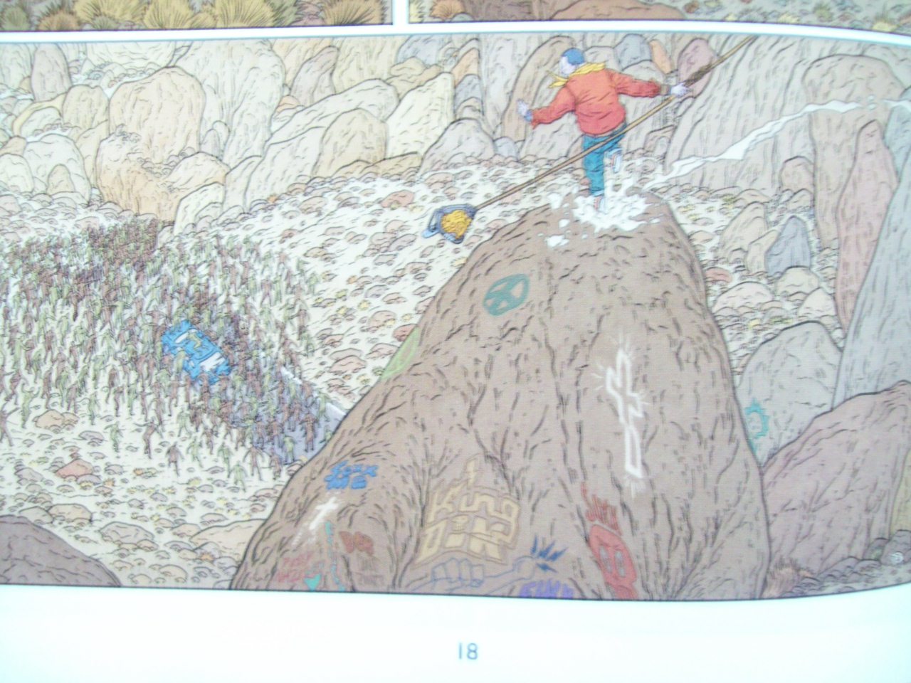
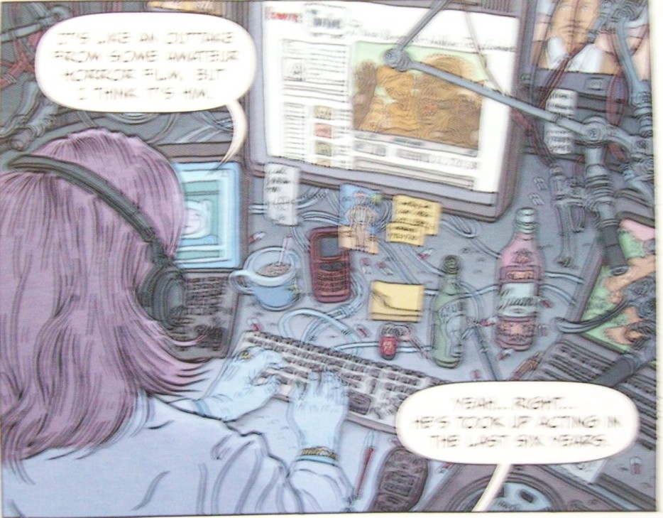
Rather than hyperrealism (Darrow doesn’t aim for photographic fidelity, only hi-def), this artwork can be considered hyper-materialist. Like with subsequent detail-obsessed artists James Stokoe and Christian Slade, everything about the world is summed up in the little details, point-blank stating an objective, physical reality occurs even when one is not looking (yet, paradoxically, only seems to matter when one is). A group of slackers encountering the Shaolin Cowboy, and the undead he battles this issue, have a car packed with candies, drinks, and junk food telling exactly what their routine is day after day (likely including some percentage of the spray-painted desert rocks); this is mirrored by an NSA satellite whose techies have similarly disheveled appearances and sloppy workstations–the satellite is also stamped with corporate logos, connecting America’s surveillance apparatus with the online targeting of Facebook ads. Darrow practically begs questions about the entire hacker/contractor structure which Edward Snowden currently is the face of with his imagery.

shaolincowboy-1_nsa

This in itself is much more impressive than Jim Lee’s gaudy-yet-sterile gatefold poster pages from Superman Unchained #1 (hyped for their size like a dick-wagging contest). Darrow not only has more social-savvy than Lee, but better design sense, too. Darrow’s pages move, whether it’s the opening splash (mostly empty space until you get to a frog on a rock) or the moment-to-moment transitions (such as Shaolin Cowboy glancing left and right before sighing with exasperation). Lee is content with blowing up standard action poses (Superman smashing a DC version of the International Space Station) to make collector’s items–disrupting the flow of the comic itself for shameless consumerism.

shaolincowboy-1_sigh

Where Lee promotes mindless, lifeless destruction (for all the Scott Snyder narration, those poster images lack any context or purpose beyond Superman punching metal), Darrow invites closer inspection. The clutter never interferes with the action: Darrow’s layouts, coupled with Dave Stewart’s colors (exchanging the noir tones of Fatale and Hellboy for a blues-and-earth palette, leaving the Cowboy in primary colors), always make his trash a sideshow attraction, simultaneously moving the action forward but allowing readers to linger on life they might otherwise ignore in their daily reality. As good as the fidelity of Hitch or Cassaday is, or as superficially spectacular as those Lee pages are, that quality of capturing life, like Courbet and Daumier, is missing. In that respect, Darrow trumps realism.

shaolincowboy-1_fuckshit

Throwing His Mighty Avengers

amazing-spider-man-essential

From Essential Spider-Man vol. 1 (Amazing Spider-Man #15)
Art/Plot by Steve Ditko, Words/Editing by Stan Lee

So, The Comics Journal has yet another Kirby/Lee argument going. Yet again, it devolved into a shouting match about whether or not Stan Lee is a doodoohead who couldn’t write his way out of a paper bag (or something?), overtaking Robert Steibel’s wonderful breakdown of Jack Kirby pages and the “Marvel Method” (again). Essentially, if you read any Comics Journal comment thread on the subject, you’ve read this one. Exactly. If there isn’t Patrick Ford’s contempt for genre (happily promoted by the Journal) or Robert Stanley Martin’s contempt for sound rhetorical skills (promoted by a guy named George), everyone seems contemptuous of saying anything of substance about creator’s rights, because they’d rather treat the system which starved out so many old pros as Team Edward/Team Jacob shenanigans (or Marvel v. DC shenanigans, even). More about egos than principles in the House That Groth Built.

*sigh*

Mighty Avengers #2
Art by Greg Land
Writing by Al Ewing
Published by Marvel

mighty-avengers-2_hey

With Mighty Avengers, Greg Land seems to be trying to prove something here. The tracing–fashion mag, porno, or whatever source is this week’s Greg Land joke–so often present in his pages is dialed back to a handful of civilians, as are the celebrity referencing which also typifies his work. While the dominance of Spider-Man masks (be it Octo-Spider-Man or “Spider-Hero”) and Kirby-themed alien invaders can be a partial explanation, even characters shown with regular faces (Luke Cage, Dr. Strange, and an oddly whitewashed Monica Rambeau) all seem to be drawn entirely from Land’s pencil without copying.

mighty-avengers-2_shark

Would be admirable, if the result did not immediately draw attention to Land’s numerous other faults. Namely, the plastic nature of his faces and barely coherent action. Fist fights are stuck in forever muddled closeups, more often content with showing the faces of who is doing the punching rather than the actual act of the punch, eliminating all sense of space and movement within his single-panel, meticulous recreations of Manhattan. And while Land’s photoreferenced horrors from comics like Iron Man or Ultimate Power helped discredit the Comic Realist art movement once popularized by Bryan Hitch, John Cassaday, and Steve McNiven (who managed to emulate realism through body language and facial expressions which matched what the script calls for, what Land never grasps), worse still is his attempt at depicting a shark torpedoing through water: so ramrod stiff and lifeless it may as well be a picture of a block of wood, there’s hardly any of the brutal, prehistoric grace one gets from Sean Murphy’s moody artwork in The Wake.

mighty-avengers-2_cage

This proves to be yet another mismatch for writer Al Ewing, whose American work (such as his otherwise excellent Jennifer Blood run) has been marred by inconsistent, anatomically challenged artwork (being paired with Butch Guice for an Age of Ultron tie-in was a stroke of mild genius, offset by it being an Age of Ultron tie-in). Ewing’s snappier moments–including his depiction of Dan Slott’s “Superior” Spider-Man as petty, small-minded, and possibly bigoted–are undone by Land’s sloppy setpieces: Spider-Hero at one  point “steals” a beatdown from his namesake, mocking “Superior’s” logorrhea (“Less #$%@, more hit”); Land draws the characters in total isolation from one another (Spider-Man shouting “Hey” off-panel when the steal occurs), diluting the scene’s impact. A later brawl between Luke Cage and the sadistic Proxima Midnight similarly isolates its characters to create the impression they are furiously punching air. Absolutely zero respect for spatial relations. Only thing Land proves is he isn’t learning.

Popeye #15
Art and Writing by Bud Sagendorf
Published by IDW/Yoe Books

Where IDW’s revival of Dinosaurs Attack has been dolled up with shiny new paper and digital lettering, the Popeye reprints stick with old-fashioned newsprint. Much to its benefit, this actually prevents Bud Sagendorf’s artwork from seeming incongruous and dated, the way Herb Trimpe’s pencils in DA seem to exist on a separate plane from the floating word balloons and captions (modern mainstream comics have this problem too, if mitigated by the fact artwork is made entirely in this digitized schema). Instead, his imperfectly colored bright reds/deep blues are allowed to pop in a format they were intended for, rather than desaturate in one they were not (the way so many old movies end up looking more hideous in hi-definition remasters).

popeye-15_next

This time capsule approach works best with the comic material: Popeye helping animals in a Dr. Doolittle riff, Popeye resolving a problem on a rail line, and side stories with Wimpy, Olive Oil, and cowboy Ham Gravy. With the Popeye vignettes, Sagendorf portrays an oddly fluid class system: his oafish, well-meaning hero exemplifying blue collar ethics and pragmatism (the comic is peppered with DIY crafting instructions), rolling up his sleeves and working himself to exhaustion, such as caring for every single animal which comes to him with a problem in “Animal Talk”; yet, he is also portrayed as independently wealthy (owning a rail line in addition to his own boat), allowing him and his supporting cast to engage in such offbeat adventures. Sagendorf seems uninterested in any particular class theory–not socialism, lifting all boats on a rising tide, nor the “might makes right” of hyper-capitalism. Even when Popeye performs feats of strength, with spinach of course, they’re deployed in non-violent means: pulling a train sans engine or walking through a wall to teach a steak-loving bully the value of eating one’s veggies. Conservative masculinity with a more pronounced empathy for others marks Popeye as a Teddy Roosevelt, a Republican who would confound and anger the Reagan-histrionics of modern-day Tea Party businessmen and fundamentalist Christians

popeye-15_diy