[Edited the title of this post to remove a cultural reference I have since learned is offensive. Sorry for my previous ignorance on this matter]
About the only big thing happening in comics things over the last week was the “Artists V. Writers” debate flaring up yet again. It’s actually a good, much needed discussion, and David Brothers chronicles many of this round’s more enticing bits here. At this point, my $0.02 is gonna matter even less than it usually does, but I will say it’s because this discussion is ongoing that I try (and often fail) to comment on as much of the production of a comic as I can in any given review. Most of the time, I end up fixating around one or two elements that I think encapsulate how I react to that particular comic. Sometimes it’s the writing, sometimes it’s the art, other times it’s the politics or the use/misuse of advertisements. Usually, it’s a combination of the first two. And, come to think of it, I hardly ever mention the inking or lettering of a comic, which isn’t exactly fair.
And yet, I continue to have nothing to say about those things in the following reviews. Not much of an epiphany, is it?
Batman Incorporated #13
Art by Chris Burnham
Writing by Grant Morrison
Published by DC
The credits, a two-page spread of Batman and Talia dueling in front of an ouroboros, seems to be the key to this finale and the run that it concludes. Everything cycles back to the beginning, eating its own tail, with nary a second’s thought to changing course. Batman may get scraped up, may lose a sidekick or two, a villain may or may not die, but these things get brushed aside and more Batman comics will come out, without fail. It won’t matter how cleverly you deconstruct all the tropes, or how great your artwork is (and Chris Burnham’s inset panels of Batman and Talia making out while Leviathan and Batman Inc. battle in the streets of Gotham, and the weird gender war thing it represents, shows what a great damn storyteller he is), you’ll get replaced on that long conveyor belt to the snake’s mouth. This becomes the problem with superhero meta-fiction, which Grant Morrison’s final issue clearly is: futility and corporate servitude are the only conclusions. Even when a victory is as satisfyingly unsatisfying as the one Batman has, it’s not an ending, just a stopping point, because there’s more or less the same thing coming out next month. The only parts that matter are the little stops along the way, because even someone with as big a God Complex as Morrison realizes the broad storyline’s never going to matter with these things, because it’s just going to continue spiraling inward on itself. Morrison even has Commissioner Gordon narrate “It never ends”: Batman will brush off the wounds, get a snazzy new sidekick (and maybe a spinoff or two), and here we go again. While reading this series has been a pleasure, the inevitable fake-ending would and will leave me feeling queasy.
Lenore #8
Art and Writing by Roman Dirge
Published by Titan
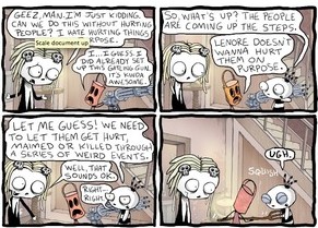
Roman Dirge’s big success with Lenore is how the grotesque and the childlike overlap. Dead girl Lenore behaves exactly like a little kid, and similarly shows little understanding of the very real consequences of violence and death inflicted upon mere mortals by her guardian/buddy Taxidermy (who is revealed in the prologue to be an Egyptian protection god of children). This itself leads to her imagining a Ghost Hunters-style TV host (looking to film her and become rich) as a butterfly when she is informed that is what’s being done to him. Taxidermy himself, who is only barely seen in the comic (Lenore‘s other characters, Pooty and Ragamuffin, provide most of the interaction), attempts to balance his violent tendencies (killing people who harm children) with consideration for children themselves, which leads to the comic’s most hilarious moments (the words “You’re welcome. P.S.: I left you a sack lunch” are written for a child in the blood of his abusive parents). All in all, a charming comic.
The Wake #3
Art by Sean Murphy
Writing by Scott Snyder
Published by Vertigo
I’m not sure if I’m meant to take this seriously anymore. The tone and direction of The Wake changes so quickly, so dramatically, it renders any real analysis of it moot. Solemn, silent pages where Sean Murphy depicts the origins of life are immediately followed by Sci-Fi Channel-movie monster-on-the-loose action sequences, and characters we’re barely familiar with are given big, dramatic moments–a poacher has a one-sided Predator standoff with the escaped merman. Problem is, that stuff only works if your audience becomes familiar with the character in question. This is usually the problem for superhero crossovers like Age of Ultron, and Scott Snyder tends to write on that soap operatic level, where interesting hooks are introduced and then paired with scenes pandering to the lowest common denominator (it’s to Snyder’s credit none of his dialogue is as dumb as “Ow! My ass!”). The Wake makes the same mistake as Age of Ultron (and Secret Invasion, House of M, and Siege, basically all of Bendis’ Avengers work) of not bothering to flesh out either characters or ideas.
But, where that comic started as garbage and got less interesting as it dropped one hook after another as if daring readers to stop buying (a dare which I accepted and won), The Wake remains interesting. Even as the plot plays out like a stage performer going to great lengths to debase himself for the amusement of its audience, Murphy and colorist Matt Hollingsworth create a unified aesthetic that does more to make the disparate parts whole than the writing does. The last two pages have the same structure as the first two pages, with an explosion marking a dramatic shift in environment, as if we’re seeing bookends to specific epochs of Earth. It also helps Snyder isn’t forgetting about any specific aspect: the future stuff doesn’t appear, but the opening pages do recall that flooded world. The result? I’m actually willing to keep at it with this.
3 Guns #1
Art by Emilio Laiso
Writing by Steven Grant
Published by Boom
Clearly getting the jump on the Hollywood franchise machine (this follows 2 Guns, a movie of which is now out in theaters), 3 Guns wears its action flick ambitions on its sleeve. Every page features either violence, the threat of violence, or a woman in a tight-fitting dress. Often, there are highly skewed angles and scenes at ass height in the manner of Michael Bay excess (not an insult. Rafa Sandoval’s been doing roughly the same thing in Catwoman, and it’s been great). While Steven Grant turns in a decent enough script based around plans within plans, a fight comic should really be an artist’s showcase; problem is, the art fouls up.
A lot of the action Emilio Laiso draws is sloppy: when ex-DEA agent Bobby ambushes a militia that’s pursuing him, he manages to grab their leader right after he got out of a car that had just parked. Later, when Bobby gets in a fight with his 2 Guns co-star Marcus (who is working with Russian mobsters), he ends up punching the ground while Marcus is mid-fall. There’s no consideration for time and space, like with Paul Gulacy or Guiseppe Camuncoli, or even the stylized pose of Frank Miller, just placeholders for movie storyboards. Moreover, the junk food nature of the material would be better suited by the bright, primary colors of Matt Hollingsworth’s Hawkeye work, rather than Gabriel Cassata’s shiny, muted coloring (it certainly lacks the oppressively hot oranges and whites of the film). About the only worthy visual moment is when Grant and Laiso get contemplative: Joey, a diner girl seemingly allied with the militia, asks Bobby what is basic about human decency, with the panel half black and half brown as if to indicate the confused moral state of these characters. Everything else is apathy and cash-in.
The Long Journey
Art and Writing by Boulet
Self-Published
Calling Boulet’s The Long Journey a great webcomic almost seems a disservice. In a genre more overloaded with crap like Ctrl+Alt+Del or PVP than even mainstream publishing can get away with, this goes outside that circle altogether. It becomes refreshing and vital.
Nominally, Boulet adopts the style of retro video games (read: 8-bit and 16-bit), although really more detailed with closeups and changing camera angles. He does carry the surrealist logic of Nintendo platformers, though, with his avatar leaving the humdrum real world through his toilet and into an ongoing fantasy land (the weird English translation adds to the effect). The comic is one long vertical mural utilizing the Infinite Canvas, forcing readers to scroll downwards. The effect is evocative of both Legend of Zelda‘s overworld and flipping through the pages of a comic book, yet is a rare instance of a webcomic that could only really work in the format of the internet (that is, unless someone wants to loan Boulet a skyscraper and let him go all Christo on it). And as the reader scrolls further downward, encountering giant plants, demons, Nazis, sea creatures, a T-Rex, and more, they are immersed in Boulet’s own escapism. The opening, a dreary rain in a gray city, is all we get of the real world, and it’s enough to go along with the deliberate nonsense that follows. Boulet at length writes about fantasy worlds like Narnia, and expresses frustration at the familiar (he shouts “Of course!” repeatedly). He even mocks the idea of traveling the world to escape as cliche (“If the world bores me, I don’t think the solution can be more world”), though the arc he follows is remarkably similar: encounter new places, note common themes (graffiti showing up in unlikely places), get in scrapes, meet a girl (a mermaid in this case), moments so brief they can hardly seem real. It’s introspective in all the right ways, with Boulet discovering his passion for life as he debates the metaphysical nature of his existence and his art, which he admits is based on whimsy. And where he arrives is beautiful.


